
Looking for the essentials of conference poster design? Here’s what you need to know:
| Conference Poster Design Basics | Details |
|---|---|
| Size & Format | Typically 36″×48″ or 48″×36″ (landscape preferred) |
| Content Structure | Title, authors, introduction, methods, results, discussion, references |
| Text Amount | 300-800 words total; readable from 10 feet away |
| Visual Composition | 30-40% white space, 40-50% graphics, 20-25% text |
| Font Size | Title: 72-96pt, Headers: 36-48pt, Body: ≥24pt |
| Best Software | PowerPoint, Adobe Illustrator, Canva, Inkscape |
Conference poster design is both an art and a science, blending visual storytelling with academic rigor to create a powerful communication tool. In the busy environment of a conference hall, your poster has just seconds to capture attention among dozens or even hundreds of competitors. A well-designed poster doesn’t just summarize your research—it creates conversation opportunities and makes your work memorable.
Research shows that people who are standing (as in poster sessions) are more engaged learners than those sitting in talks. This active engagement is what makes poster sessions such valuable networking and feedback opportunities. Your poster serves as both your research ambassador and your conversation starter.
The challenge lies in distilling complex information into a visually appealing format that can be absorbed quickly. Unlike a full paper or presentation, a poster must communicate its key message at a glance while still providing enough depth for interested viewers to engage meaningfully with your work.
As Brett Henrichsen, I’ve spent over 20 years helping researchers and businesses create effective large-format prints through Posterprintshop, witnessing how thoughtful conference poster design transforms complex research into accessible visual stories that command attention and drive engagement.
A conference poster is your research’s visual handshake—a big, friendly snapshot that sums up what you’ve finded, why it matters, and why folks should care, all at a glance. Think of it as the sweet spot between a dense research paper and a quick elevator pitch: you have enough space to share your story, but you’re challenged to keep things clear and concise.
Where a journal article might gather digital dust or a talk might be over in a flash, a poster draws people in. It’s your chance to spark real, personal conversations—right there, standing beside your work. Plus, conference poster design encourages you to highlight only your most important findings, so your message lands fast and sticks.
Most effective posters are short and sweet: 300-800 words total. That’s just enough to be informative, but not so much that you lose your audience. And remember, your text should be big and bold enough to read from about 10 feet away! Less is more here—clarity and simplicity are your best friends.
Engagement is the real magic of poster sessions. Studies show that people are far more attentive and interactive when standing—up to 60% more engaged compared to sitting through talks. In the lively poster hall, you’re not just presenting—you’re connecting, answering questions, and building your professional network. It’s a fantastic boost for your career visibility.
Presenting a poster also gives you an edge in job hunts, grad school applications, and grant proposals. It’s easy proof that you can communicate ideas clearly and interact with the broader community.
While oral presentations have their own perks, conference poster design opens unique doors. Your poster gets to hang around all day, catching eyes and drawing interest—unlike a talk, which is often over in minutes. You can chat at your own pace, answer questions in a low-pressure setting, and even switch languages or explain concepts however makes sense.
Poster sessions are also famously welcoming for non-native speakers. There’s no rush to find the perfect words on the spot. You can point, gesture, and use visuals to make your point. Poster sessions were actually invented to level the playing field for presenters from all backgrounds!
Plus, the one-on-one moments you get around a poster are where real collaboration starts. It’s much easier to swap business cards, share ideas, and plant the seeds for future projects. As research in Social Psychological and Personality Science shows, the simple act of standing during a poster session helps everyone stay more alert, curious, and engaged.
Knowing what to expect sets you up for success. Here’s how most poster sessions unfold:
First, you’ll arrive a little early—usually 30 to 60 minutes before the session starts—to hang your poster and settle in. During the main session, attendees drift through the hall, scanning for eye-catching titles and bold visuals. If your poster grabs their attention, you’ll have about 3 to 5 minutes to make an impression and start a conversation.
Peak traffic tends to hit right after popular talks or during official “poster hours.” Plan to be present and ready to engage during these busy stretches. And don’t be surprised if the most meaningful chats happen after the session is “officially” over!
Poster sessions are a classic starting point for first-time presenters. As Dr. Annaliese K. Franz of the Undergraduate Research Center puts it, they’re “great experience for first-time presenters” and follow a “standard format used at many professional meetings” to help you get feedback, network, and build your resume.
In the end, a well-designed conference poster is far more than just a summary of your research. It’s your chance to stand up, stand out, and build new connections in your field—one conversation at a time.
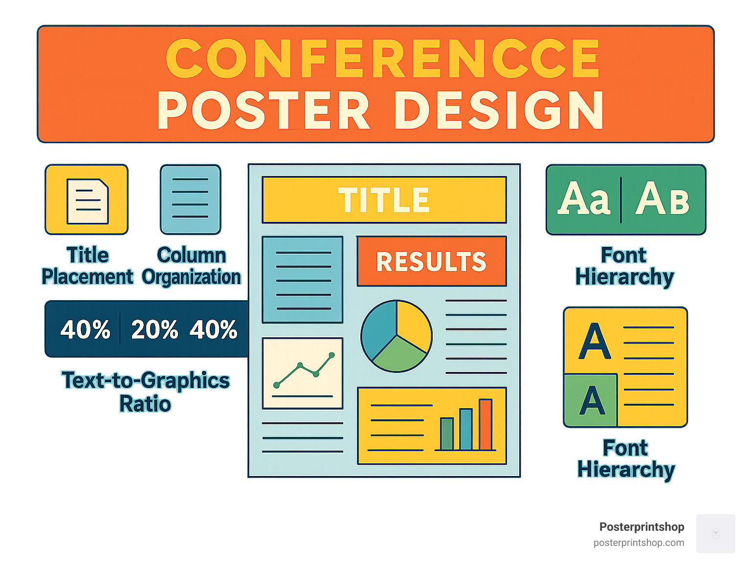
A great conference poster design starts with a clear, tried-and-true structure, but there’s still plenty of room to show off your creativity. Think of your poster as a story told in three acts—introduction, evidence, and punchline—with lots of visual flair in between. The best posters aren’t crammed with text; they give the eye room to breathe and let the visuals do the heavy lifting.
Research shows the magic recipe for a winning poster is about 30-40% white space, 40-50% graphics (figures, images, charts), and only 20-25% text. That means most of your poster should be visually driven, not a wall of words.
Every effective poster includes several core sections, each with its own job:
Many presenters now make the QR code a central feature—letting curious readers access everything they want, while keeping the poster itself open and inviting.
Let’s face it: almost no one is going to read your poster from top to bottom. People scan conference posters, so your layout must make it easy for them to find the good stuff fast.
Most eyes follow an F-pattern—glancing across the top, then down the left side, and scanning horizontally where something catches their attention. That means you want your most important messages, visuals, and section headers right along these paths.
Stick to a left-to-right, top-to-bottom flow (especially for Western audiences), and use large, bold section headers to break up content and guide readers along. If your poster has a specific reading order, use arrows or subtle numbering to help out.
A great trick is to include a central visual anchor—a big, bold graphic or your main result—right in the middle. This draws eyes in, and then viewers naturally work outward to find the details.
Pro tip: Skip a separate abstract section. Instead, treat the whole poster as an extended abstract, focusing on clarity and avoiding repetition.
The goal of conference poster design is to spark conversations, not to replace your full research paper. Aim for a total word count of 300-800 words across all sections. Use bullet points for lists, and keep paragraphs short and sweet.
Write in plain language wherever possible. Minimize jargon, spell out acronyms, and use sentence-case for titles (it’s easier to read than ALL CAPS). If you can explain an idea with a picture or diagram instead of a sentence—do it! Your visuals should do most of the talking.
As one design guide wisely puts it, “Less is more. Accept it by using fewer words and larger images.”
You’ll be standing by your poster, ready to answer questions and fill in details. Your poster’s job is to make your research approachable, memorable, and—most of all—easy to understand at a glance. That’s what turns passersby into collaborators… and makes your time at the conference a win.
When it comes to conference poster design, your visual choices are what will make people stop, look, and (hopefully) spark a conversation. A great poster isn’t just pretty to look at—it guides the viewer’s eye, makes key points stand out, and makes your research easy to grasp, even in a crowded hall. Let’s walk through the essentials of designing a poster that’s not just beautiful, but effective.
First, every good poster starts with a modular grid structure. Think of your poster as a well-organized closet: everything in its place, with clean columns or sections and even spacing. This structure keeps your content tidy and lets viewers scan for what matters most to them.
Color harmony is next. Choose a color palette with just three or four main colors (plus black and white) that work well together. Too many colors can overwhelm your message or worse, make your text hard to read. Your goal is to attract attention—not alarm it!
Visual hierarchy is your secret weapon. Make your most important points large, bold, or in a standout color so viewers know exactly where to look first. Negative space (the empty space between elements) is just as powerful. Don’t feel pressured to fill every inch—white space makes your content easier to digest and lets your ideas breathe.
Consistency is the finishing touch. Use the same fonts, color shades, and graphic style throughout. This keeps your poster feeling professional and unified. As one design expert puts it, “Most posters fail not because they’re ugly, but because they don’t concisely explain what was done and why.” So, always focus on clarity before worrying about making things look fancy.
A strong layout grid is the backbone of top-notch conference poster design. Start by dividing your poster using the rule of thirds—imagine a tic-tac-toe board overlay, and try to place your most important visuals or results where those lines cross. For most posters, using 2-3 columns (portrait) or 3-4 columns (landscape) helps organize your sections cleanly, with even gutters (spaces between columns) to keep things readable.
If you want your design to really shine, try using the golden ratio (1:1.618) when sizing your content blocks. It sounds fancy, but it just means making one side of a section slightly longer than the other—a trick artists have used for centuries because it just feels “right.” Finally, use alignment guides so all your elements line up nicely. Nothing says “pro” like straight edges and balanced margins.
Sketch your layout on paper before you design it on your computer. This simple step can help you spot any crowded sections or missing pieces before you spend hours moving text boxes around.
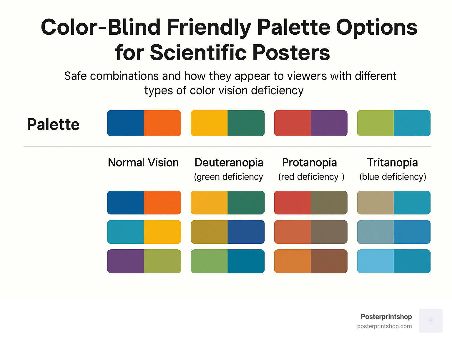
Choosing colors isn’t just about looking good—it’s about being understood. Use a limited palette (three or four main colors, max) to keep things consistent and easy on the eyes. For posters you’ll print, always pick your shades in CMYK color space (not RGB), or you may be surprised by the results when your poster arrives.
Make sure your text stands out with plenty of contrast—dark text on a light background is usually safest. Test your combinations using a contrast checker to hit at least a 4.5:1 ratio, so even folks in the back of the room can read your work.
Don’t forget that around 8% of men and 0.5% of women have some form of color-vision deficiency. The classic “red-green” combo can be hard to tell apart for many people. Before finalizing your poster, run it through the Coblis color-blindness simulator to make sure everyone can see your key points.
Your words should be easy to read at a distance—no one wants to squint! Stick with sans-serif fonts (like Arial, Calibri, or Helvetica) for a modern, clean look. For titles, go big—72pt or more. Section headers should be at least 36pt, while body text should never be smaller than 24pt.
Keep your leading (line spacing) between 1.0 and 1.2 times the font size, and tweak the kerning (space between letters) if things look cramped or awkward. Lines of text should ideally be 40-60 characters long—anything longer and readers may get lost.
To help you decide on sizes, here’s a quick reference:
| Font Size | Readable Distance |
|---|---|
| 24 pt | 3-4 feet |
| 36 pt | 6-7 feet |
| 48 pt | 8-10 feet |
| 72 pt | 12-15 feet |
| 96 pt | 20+ feet |
If you’re unsure, print a small section at 100% size and tape it to the wall. Step back and see how it looks—you’ll know right away if it passes the “10-foot test.”
The visuals on your poster aren’t just decoration—they’re your main storytelling tools. Whenever possible, use vector graphics (like SVG or AI files) for charts and diagrams. They look sharp at any size—no fuzzy edges! For photos, always use files that are at least 300 ppi at the final print size. This is especially important for large-format prints, where even a slightly blurry image can stand out for all the wrong reasons.
Stick with TIFF files for the best quality, or high-quality JPEGs for photos if space is tight. Place each diagram or figure right next to the text it supports, so viewers never have to jump across the poster to connect ideas.
At Posterprintshop, we always recommend viewing your poster at 100% on-screen before you send it in. This simple check can save you from any nasty surprises (like pixelated images) when your poster arrives.
Keep these best practices in mind, and your conference poster design won’t just look great—it’ll work hard for you, drawing in new connections and making your research impossible to ignore.
When it comes to conference poster design, the right software can make your project faster and your final poster much more polished. Let’s look at your main options and how to steer from your screen to a stunning, high-quality print.
Microsoft PowerPoint is by far the most popular choice for academic posters. Most people already have it, and its interface is friendly—even if you’ve never designed a poster before. Just remember to set your slide size to match your final print dimensions before you start, or you might end up with some awkward cropping at print time.
If you want more professional results and pixel-perfect control, Adobe Illustrator stands out. It’s fantastic for vector graphics, sharp logos, and complex layouts, though it does come with a steeper learning curve. Not ready for Adobe’s price tag? Try Inkscape—a free, open-source program with many of the same vector strengths.
Looking for something quick and easy? Canva is a crowd favorite thanks to its drag-and-drop interface and huge library of templates—over 666 research poster designs to jump-start your project. And for those in math, physics, or computer science, LaTeX with Overleaf is the gold standard for typesetting and exact layouts.
One thing’s for sure: there’s no “best” tool for everyone. Ease of use matters—a lot. If you want a gentle start, PowerPoint or Canva will feel like home. For those who love precise vector control, Illustrator or Inkscape is worth the effort. Don’t forget to consider cost—many universities provide PowerPoint or Adobe licenses, and Inkscape and Canva’s free versions are robust enough for most needs. If your research team is spread across the country, collaboration features become just as important. Canva and Overleaf shine here, letting multiple authors comment or edit in real time.
As one tired grad student put it, “Switching from Illustrator to Pages saved me hours—and my sanity—because the layout was just easier.” That’s the key: pick what works for you, not just for the sake of fancy features.
It’s tempting to reach for the fanciest software, but your choice should balance your comfort level, budget, and project needs. If you’re new to conference poster design, simple is smart. If you’re aiming for a true show-stopper, or need scientific precision, the extra effort of a pro tool can pay off.
Designing is only half the journey—the other half is ensuring your poster prints exactly as you expect. Here are the essentials:
At Posterprintshop, our Guide: Large Format Poster Printing breaks down these steps, so your poster looks just as good printed as it does onscreen. And if you’re unsure, our team is always ready to help make last-minute tweaks for the best results.
If design isn’t your thing (or you’re just pressed for time), templates are your secret weapon. Many universities offer their own branded poster templates—great for making sure you meet conference and institutional standards.
Canva’s template library is especially rich, with hundreds of research poster options you can customize in minutes. Overleaf is perfect for LaTeX lovers who want clean, scientific layouts without wrestling with formatting. For more inspiration, check out the Purrington Collection, which is packed with annotated examples and helpful design notes.
Whether you start from scratch or with a template, remember: structure is your friend. Templates help you avoid common pitfalls, keep your layout clean, and let you focus on what matters—sharing your research.
Conference poster design is so much easier when you have the right tools, a good workflow, and a little help from people who’ve seen it all. If you need advice or a fast, flawless print, Posterprintshop is here to help you shine at your next conference.
When it comes time to present your conference poster design, it’s more than just standing next to your work—it’s your moment to shine, make connections, and bring your research to life. Think of your poster as your conversation starter, and yourself as the friendly host ready to welcome visitors.
Start by practicing your elevator pitch. You’ll want a quick 30-second summary, a slightly longer 2-minute version, and a deeper 5-minute story for those who want the details. This way, you’ll always be ready—no matter how much (or how little) time someone has.
Your body language matters, too. Stand confidently to the side of your poster so people can see your work clearly, make eye contact, and keep your arms relaxed. An open posture invites questions and conversation, while blocking your poster or looking away makes it less approachable.
Don’t forget about the power of social media. Before your session, tweet a photo of your poster and share your location in the conference hall. Use the conference hashtag so attendees can find you, and maybe even attract some visitors who hadn’t planned to stop by.
If you want to up your engagement, consider adding interactive elements to your poster. Attaching small objects or even simple 3D-printed models can make your research more memorable and spark curiosity. In fact, studies show that posters with tactile or interactive features draw up to 20% more visitors. One creative presenter used a Lego-based 3D rig, and it became the talk of the session!
But beware of common pitfalls that can sink even the best research:
As one design expert says, “Posters without pictures suck.” Visuals are your best friend—use them to tell your story, spark interest, and invite questions.
A little preparation goes a long way! On the day of your presentation, make sure you bring pushpins or mounting materials (even if the event says they provide them—better safe than sorry), as well as business cards or printed contact slips so people can reach you later. Pack your poster in a fabric tube to protect it from creases, and bring a water bottle and some mints to stay fresh. Have a timing strategy: know when you’ll be at your poster and when you can take a break. Keep a small notepad handy for jotting down feedback or names. And always have a digital backup of your poster on your phone, just in case.
A little fun doesn’t hurt either—some presenters have used candy or small treats to attract visitors. While you don’t need to lure people in like “bait,” a friendly gesture can help break the ice and start a conversation.
To stand out among the sea of posters, don’t be afraid to get creative. 3D elements, like stereoscopic images or attached models, can make your section of the hall a destination. QR codes are a great tool too—link them to a video, your full paper, or interactive simulations. If you want to go bold, try fabric printing for a unique feel and easy transport. Sometimes a clean, simple design with strong visuals says more than a complex layout. One fun museum trick is to use hinged panels that hide extra information, inviting curious viewers to engage more deeply.
Want to see great posters in action? Check out some YouTube videos for inspiration on award-winning posters and presentation techniques.
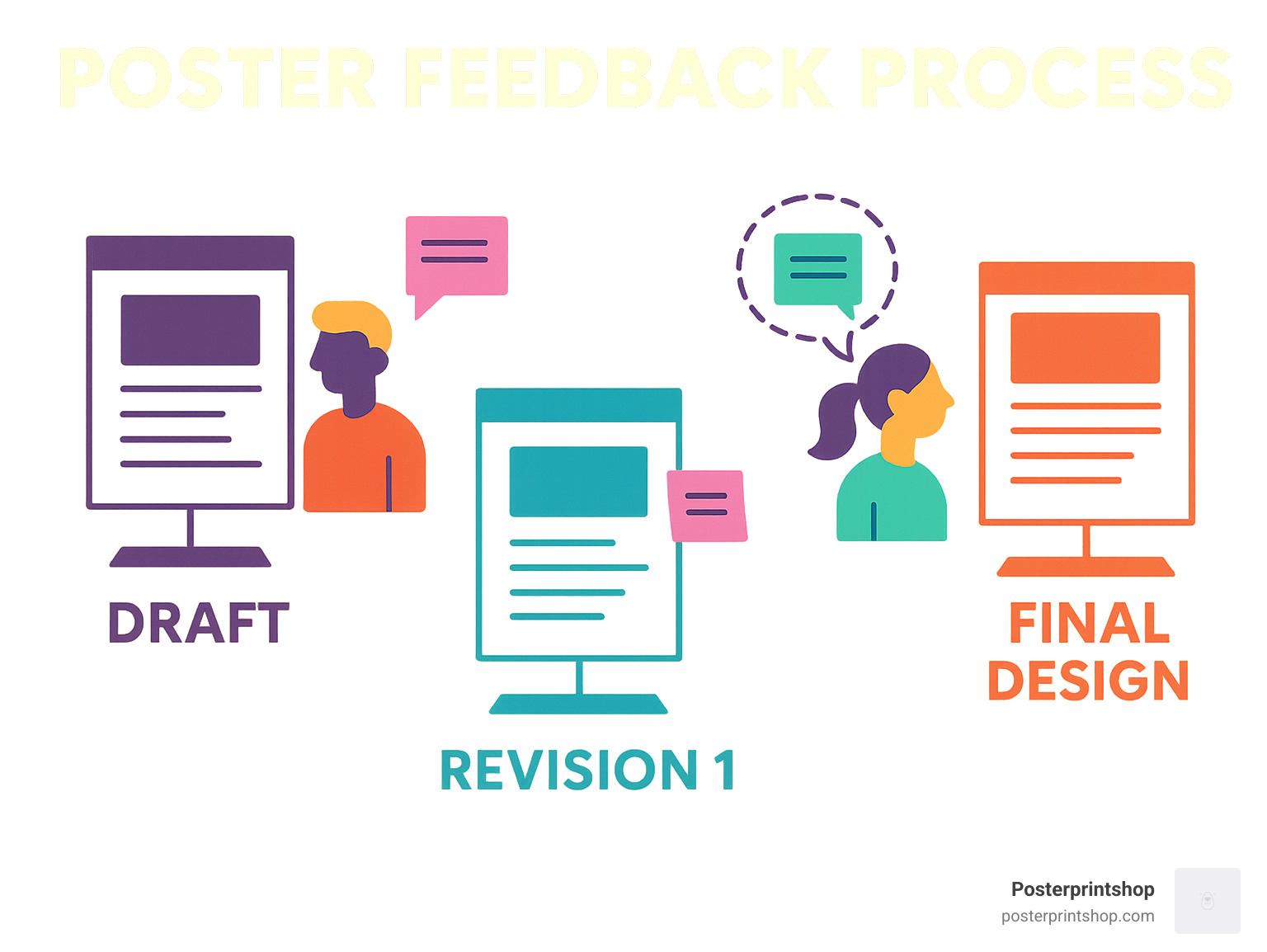
Conference poster design isn’t a solo sport—fresh eyes can spot things you miss. Before you send your poster off for printing, print a mini-version (on regular letter paper) and hang it somewhere people will see it. Invite colleagues to leave feedback with sticky notes, or offer a few treats to encourage honest critiques. Peer review helps you catch confusing spots, typos, or visuals that don’t quite work. Plan for a couple of revision rounds—you’ll thank yourself later.
One researcher swears by the hallway test: “I hung an 8½×11-inch draft up for a week and got dozens of great Post-It suggestions.” Another paid in mini-candy bars for feedback—proof that a little incentive goes a long way!
At Posterprintshop, we’ve seen thousands of posters come to life—so don’t hesitate to ask for advice along the way. Your poster isn’t just a summary of your project; it’s your chance to make an impression, start conversations, and connect with the research community. Make it count!
This is one of the biggest challenges in conference poster design: knowing when to stop writing! The short answer? Aim for 300–800 words total. Less really is more here—think of your poster as a friendly conversation starter, not a full-blown research paper taped to the wall.
If you’re creeping up toward 1,000 words (or beyond—yikes!), it’s time for some serious trimming. Most viewers only spend a few minutes at each poster, and if they see a wall of text, they’ll likely keep walking. Bullet points, short sentences, and visuals help your key points shine. Ask yourself: Can someone “get” your main message in under five minutes, even if you’re not standing there? If not, pare it down.
The best posters use graphics, charts, and photos to communicate, with text serving as captions and brief explanations. During the session you’ll be there to answer questions and provide extra detail. Your poster should spark interest, not overwhelm.
When it comes to getting your conference poster design printed, PDF is the industry standard—and for good reason. A properly exported PDF helps ensure your fonts and layouts stay exactly as you designed them, and that your images print crisp and clear.
Before sending your file, double-check these points:
PowerPoint users: Use the “Save As” function to export your poster as a PDF. This usually keeps the quality higher than the “Print to PDF” function.
At Posterprintshop, we always recommend sending a high-resolution PDF that ticks all these boxes. If you’re not sure, just ask us—we’re happy to check your file before printing!
Color is a huge part of effective conference poster design—but you want everyone to be able to read your work, not just the folks with perfect color vision.
For the best accessibility, make sure your text has a contrast ratio of at least 4.5:1 against the background. High contrast is key: Black text on a white or pale background is always a safe bet. Avoid relying on red and green for important differences—roughly 8% of men and 0.5% of women have some form of color blindness.
Want to be extra thorough? Test your poster using a color blindness simulator like Coblis. If charts or graphics need to show differences, consider using patterns or textures as well as color.
Simple, bold design choices help everyone engage with your poster. If in doubt, step back and ask: Can I read everything easily from a few feet away? If yes, you’re good to go.
Still have questions? Visit Posterprintshop’s custom poster services page for more tips and support on making your research stand out.
Great conference poster design is more than just arranging boxes and colors—it’s your chance to turn research into a story that draws people in. When you blend clear content, sharp visuals, and confident presentation, you give your work the best shot at being seen, understood, and remembered.
If you take away one thing, let it be this: focus your poster on a single, clear message. Make sure anyone walking by can “get it” in seconds. Balance is key—aim for 30–40% white space, 40–50% graphics, and only 20–25% text. Use a simple, logical layout, keep headings bold and readable, and keep your fonts large enough for the back row. Don’t forget: high-quality images make a world of difference; nothing says “trust my data” like a crisp, clean chart.
Your poster isn’t just a display—it’s an invitation to connect. Practice your pitch so you’re ready to chat, answer questions, and spark new collaborations. And remember, your poster isn’t just a wallflower; it’s the life of the conference party (or at least it should be).
At Posterprintshop, we know how much work goes into your research—and your conference poster design deserves to shine just as brightly. We print on everything from sturdy paper to easy-travel fabric, with fast turnaround times and eagle-eyed quality control. Even if your deadline is looming, we’re here to make sure your poster looks exactly the way you imagined.
Ready to share your work with the world? Start designing your poster today—and when you’re ready to print, let us help you look your best at your next conference.
Want to learn more about custom sizes, materials, or how we can help with your next project? Visit our custom posters page for all the details, or reach out to us directly. We love to help researchers bring their ideas to life!
Here’s to your next show-stopping poster—and the new opportunities it brings.