
Room print colour is so much more than just picking pretty pictures for your walls. It’s about creating a space that feels right for you—one that lifts your mood when you enter and reflects your personality. The colors you choose can completely change how a room feels, making it seem cozier, more spacious, or more energizing.
When you’re selecting wall art, think about what you want the room to say. Are you looking for a calm sanctuary or an energetic gathering space? Your color choices will help tell that story.
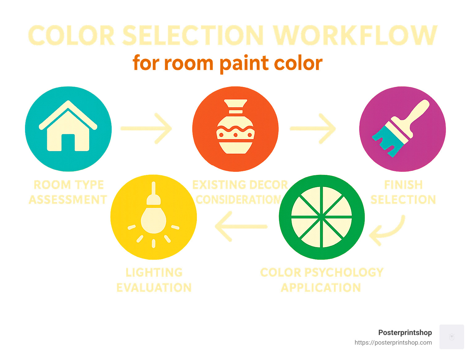
Here’s a simple guide to help you steer your options:
| Room Type | Best Colors | Why It Works |
|---|---|---|
| Living Room | Green, Blue, Neutral | Calming, serene, flexible for decor changes |
| Bedroom | Soft Blues, Muted Greens | Promotes relaxation and restorative sleep |
| Kitchen | Reds, Yellows | Stimulates appetite and energy |
| Small Rooms | Light Blues, Whites | Creates illusion of more space |
| North-Facing | Warm Undertones | Counteracts cool natural light |
| South-Facing | Almost Any Color | Benefits from abundant natural light |
Ever notice how certain colors make you feel something? That’s not in your head—it’s color psychology at work! Green tones bring a sense of balance and renewal, perfect for spaces where you want to feel grounded. Blues create a feeling of serenity and contentment, making them ideal for bedrooms or home offices. Red is a powerhouse of energy and can even stimulate appetite—great for dining areas but maybe a bit too stimulating for where you sleep.
When planning your room print colour scheme, remember the 60-30-10 rule. This designer trick suggests using 60% of your dominant color, 30% of a secondary color, and 10% of an accent color. This creates a visually balanced space while still giving you room to show your personality through those smaller pops of color.
I’ve spent over 20 years helping people find the perfect wall art colors for their homes. What I’ve learned is that the right room print colour can transform an ordinary room into something that feels uniquely yours—a space that welcomes you home and makes you smile every time you walk in.
Have you ever walked into a room and immediately felt something—calm, excitement, comfort? That’s the impact of thoughtfully chosen room print colour. Your walls are like blank canvases waiting to tell your story.
“Blank walls are not to be neglected. They provide a great opportunity for us to make any room look interesting and wonderful,” says interior designer Amanda Nicholls. And she’s right—those empty spaces are full of potential.
Wall art does more than just fill space—it sets the mood for your entire room. A serene ocean landscape in soothing blues can make your living room feel like a peaceful retreat after a long day. Bold, vibrant abstracts can energize a home office or creative space. Earthy botanicals bring a touch of nature indoors, creating a grounding effect.
The beauty of prints is how personal they can be. Whether you’re drawn to dramatic landscapes, minimalist designs, or colorful abstracts, your choices reflect who you are. Statement pieces with bold colors can become conversation starters when friends visit. Meanwhile, a thoughtfully coordinated color palette throughout your home creates a sense of flow and harmony as you move from room to room.
When you choose the right room print colour, you’re not just decorating—you’re creating an environment that supports how you want to live and feel in your space. And that’s something truly special.
When we talk about room print colour, we’re entering a whole different world compared to regular wall paint or wallpaper. Wall prints bring a richness, depth, and visual storytelling that simply can’t be achieved with a bucket of paint, no matter how premium.
There’s a bit of technical magic happening behind the scenes that’s worth understanding. Your computer screen shows colors using RGB (Red, Green, Blue), but prints come to life through CMYK (Cyan, Magenta, Yellow, Black). This difference means the gorgeous sunset you see on your laptop might look slightly different when it arrives at your door—something to keep in mind when choosing your perfect room print colour.
Here at Posterprintshop, we’re pretty obsessive about color calibration to minimize these differences. Our printing process captures those delicate color transitions that give your walls dimension and depth. If you’re curious about the nitty-gritty details (and who isn’t?), have a peek at The Importance of Color Calibration: From Screen to Print.
The paper itself plays a huge role too. Our premium ultra-white papers provide a clean canvas that makes colors pop, while textured options add a tactile element that brings subtle color palettes to life in an entirely different way.
Large-format printing opens up a world of possibilities that traditional wall treatments simply can’t touch. With today’s high-resolution printing technology, we can capture intricate details and smooth color transitions at sizes that transform entire walls into works of art.
Resolution matters tremendously when you’re going big. That sunset photo that looks amazing on your phone might turn into a blurry mess when blown up to poster size. For the best room print colour experience, start with high-resolution images that can maintain their clarity when sized up.
“The quality of your source image is like the foundation of a house,” our lead print technician often says. “Without a solid foundation, even the most beautiful design will fall apart. Higher resolution means more accurate color reproduction, especially in those dreamy gradients everyone loves.”
Planning a statement wall with a large print? I’d recommend checking out our guide on How to Prepare Images for Large Format Printing to make sure your images will shine at any size.
The finish of your print isn’t just a technical detail—it’s a design choice that dramatically affects how your room print colour appears in your space. Think of it as choosing between matte or glossy lipstick—same color, completely different effect.
| Finish Type | Color Impact | Best For | Lighting Considerations |
|---|---|---|---|
| Glossy | Improves contrast, makes colors appear more vibrant | Vibrant art, kids’ rooms, spaces with controlled lighting | Can create glare in rooms with direct sunlight or bright overhead lighting |
| Matte | Reduces reflection, shows true color without shine, emphasizes detail | Sophisticated spaces, rooms with varied lighting, framed prints under glass | Performs well in bright rooms, no glare issues |
| Satin/Semi-Gloss | Middle ground: good color vibrancy with reduced glare | Versatile option for most rooms | Good all-around performance in various lighting conditions |
“Lighting is everything when choosing a finish,” as our print specialist loves to remind customers. “That glossy finish might look amazing in our showroom, but if your living room has floor-to-ceiling windows, you might end up with more glare than glamour.” For sunny spaces, matte finishes can be your best friend, showcasing your chosen room print colour without turning your wall into a mirror.
Glossy finishes create a wonderful sense of depth that makes images seem to leap off the wall. They’re perfect when you want maximum visual impact from vibrant artwork or colorful photography. Just keep in mind that very dark or heavily saturated prints might not appear as glossy as expected, since “toner pearls on semi-gloss paper sit on the surface, reducing gloss in heavy coverage areas.”
Matte finishes, meanwhile, are the sophisticated choice when you want to highlight the subtle details and textures within your print. They’re also ideal when you’re planning to frame your print under glass—no one wants that distracting “double reflection” effect that can happen with glossy prints behind glass.
Have you ever walked into a room and immediately felt calm, energized, or maybe even a bit anxious without knowing why? That’s the power of color at work! When selecting your perfect room print colour, understanding a bit of color psychology can make all the difference in creating spaces that feel just right.
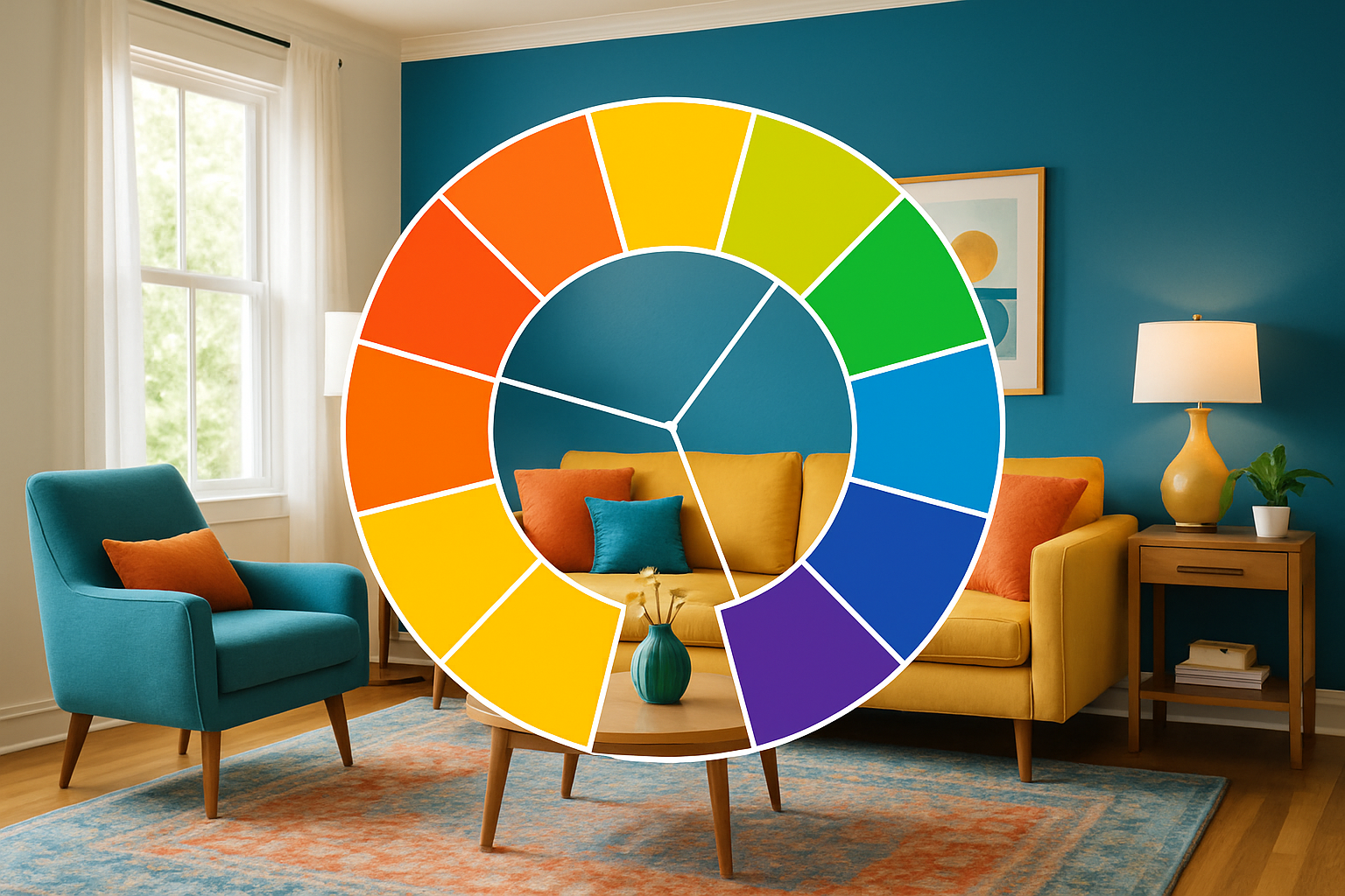
Blues bring a sense of tranquility that’s perfect for bedrooms and living rooms where you want to unwind. Greens connect us to nature and create balance—they work beautifully almost anywhere you need a calming influence. Reds energize a space and even stimulate appetite (there’s a reason so many restaurants use red in their decor!). Yellows brighten your mood like sunshine, making them wonderful for entryways or rooms that lack natural light. And purples? They add a touch of creativity and luxury to studies or artistic spaces.
When planning your space, the 60-30-10 rule is your friend. Think of it as a recipe for visual harmony: 60% of your room should feature your dominant color (usually walls or large furniture), 30% can be your secondary color (perfect for that statement wall print you’ve been eyeing), and 10% comes from accents that add personality and pop.
As interior designer Elaine Santos reminds us, “Above all, colour is uniquely personal. So, it’s important to choose a colour that works for you and your home.” This is especially true for art prints you’ll see every day—choose what speaks to you, not just what’s trending.
Natural light plays a huge role in how your prints will actually look on your walls. North-facing rooms get cooler, bluish light that makes cool colors appear more vibrant while somewhat dulling warm tones. South-facing rooms bask in warm, golden light that improves warm colors and softens cooler ones. Before finalizing your room print colour choices, observe your space at different times of day to see how the light changes.
For the technically minded, understanding color spaces ensures your prints come out just as you imagined. If you’re creating custom prints, take a peek at Should I Use CMYK or RGB Color Space in My Files? to avoid any surprises when your prints arrive.
Your living room is where life happens—conversations flow, families gather, and friends connect. That’s why your room print colour choices matter so much here. Green has become the living room color champion, with nature-inspired shades creating that “ahh, I’m home” feeling we all crave.
When choosing prints for your living room, look to your furniture for guidance. If you’ve got neutral pieces (those lovely grays, browns, and beiges), you’ve hit the jackpot—your walls become a canvas for almost any print color you fancy. Use wall art to introduce those bolder colors you might not want for your sofa!
Want to create a focal point? Choose a large-scale print in a color that complements your dominant room color. A rich blue print against warm neutral walls creates instant drama and draws the eye exactly where you want it.
For the neutral-lovers among us, texture becomes your best friend. Layering prints with varied textures in similar neutral tones adds depth without shouting for attention. As one designer put it, “Varied textures make subtle palettes sing.”
Finding that sweet spot between bold and neutral creates living rooms with personality and staying power. One of our customers recently transformed their space with emerald green botanical prints against cream walls. “The prints brought the room to life without overwhelming the space,” they told us. “Guests always comment on how the green creates such a peaceful feeling.”
Your bedroom should be your sanctuary—the place where the day’s stress melts away and sleep comes easily. Room print colour choices here should promote relaxation rather than stimulation. Color psychology suggests cool shades like baby blue, navy, and hunter green encourage better sleep by actually lowering blood pressure and heart rate.
Soft blues and greens work wonders in bedrooms, especially in larger prints that can anchor your color scheme. For a spa-like retreat, consider prints with predominantly white or cream backgrounds with just hints of color. These create an airy, serene atmosphere that helps your mind unwind.
Designer Minnette Jackson created her dream bedroom using a muted green-blue inspiration (Sherwin-Williams’ Sea Salt). “Our bedroom has windows on three sides, so it feels a bit like you are perched up in your own private little treehouse,” she shares. This kind of muted tone creates the perfect backdrop for restful nights.
Sometimes texture trumps color in bedroom prints. Black and white photography or simple sketches add visual interest without the stimulation that bright colors bring. This approach works beautifully for those who want their bedroom to feel like a true retreat from visual noise.
One word of caution—those vibrant reds, oranges, and yellows that look amazing in other rooms? They’re best used very sparingly in bedrooms, as these energizing colors can actually make it harder to fall asleep. Save them for spaces where you want to feel awake and alert!
Kitchens and dining areas are where we gather to nourish both body and soul. The right room print colour choices here can stimulate not just appetite but also conversation and connection. Reds have long been associated with increased appetite (hello, restaurant décor!), making them a natural choice for these spaces.
Food-inspired colors bring a delicious energy to kitchens and dining rooms. Prints featuring rich reds, sunny yellows, and fresh greens echo the colors of fresh produce and stimulate both appetite and mood. For a truly theme-appropriate choice, beautiful food photography or vintage food advertisements make perfect kitchen art—they combine relevant subject matter with appetite-enhancing colors.
In kitchens, practicality matters too. Prints should be protected from the inevitable moisture and food splatter that cooking creates. At Posterprintshop, we recommend choosing prints on wipeable surfaces or protecting them behind glass for longevity in these high-activity spaces.
Color combinations can create unexpected magic in dining areas. As one color expert suggests, “Tangerine paired with cornflower blue creates an unexpected but delightful dining room palette.” This combination energizes the space while maintaining a sophisticated vibe perfect for entertaining.
For more targeted advice on room-specific color schemes, check out Which Colour Schemes Work Best in Which Rooms? for inspiration custom to each area of your home.
The size of your room should absolutely influence your room print colour choices. Color doesn’t just affect mood—it dramatically impacts how we perceive space itself. Light colors make rooms feel more expansive, while darker hues create intimacy.
In small spaces, prints with predominantly light colors (whites, pale blues, soft greens) reflect more light around the room, creating an airier feel. But here’s a surprising tip: large-scale prints can actually make small rooms feel bigger by creating a focal point that draws the eye through the space. Position your prints strategically—hanging them to draw the eye upward or to the furthest point in the room creates an illusion of more space.
Large rooms present the opposite challenge—how to make them feel cozy rather than cavernous. Rich, saturated colors in your prints can create drama and intimacy in spacious rooms. Deep blues, emerald greens, or even black prints can anchor a space and prevent it from feeling impersonal. Consider creating a gallery wall with multiple prints in a cohesive color scheme to effectively fill large wall spaces, or go bold with a single oversized statement piece.
One designer who specializes in small spaces offers this counterintuitive advice: “Painting walls and ceilings black creates an effect similar to ‘looking up at the night sky.’ It creates an ‘infinity effect’ that can make a room feel larger, not smaller.” This same principle applies to your print colors—sometimes dark prints can visually recede, creating a sense of depth that expands rather than shrinks your space.
At Posterprintshop, we’ve helped countless customers find the perfect room print colour for spaces of all sizes. Whether you’re working with a cozy studio apartment or a sprawling open-concept home, the right print colors can transform how your space feels and functions.
Wondering what colors will make your walls sing this year? As we move through 2024-2025, there’s a beautiful shift happening in room print colour preferences that might inspire your next art purchase.
Gone are the days when gray dominated everything! We’re now seeing a warm wave of earthy browns and terracottas taking center stage. These natural tones bring a grounded, cozy feel to any space while providing a perfect backdrop for almost any art style. One customer told me, “I was surprised how my landscape prints came alive against a warm terracotta wall – it feels like the colors have more depth now.”
For those feeling a bit more adventurous, chartreuse and acid yellow are having quite a moment. These vibrant yellows with green undertones might sound intimidating, but when used in wall art against neutral backgrounds, they create energetic focal points that transform ordinary rooms into conversation starters.
Sea-salt green has become my personal favorite recommendation for clients seeking tranquility. This soft, muted green with subtle gray undertones works beautifully in virtually any room – it’s like bringing a whisper of nature indoors without overwhelming the senses.
And let’s not forget about mauve purple! This sophisticated shade sits comfortably between purple and pink, adding unexpected warmth to contemporary spaces. It pairs brilliantly with metallics and natural textures in prints.
While trends are fun to explore, I always remind customers that certain room print colour schemes have stood the test of time for good reason. Black and white prints offer timeless elegance that works in virtually any setting – from minimalist apartments to traditional homes. Navy and cream pairings bring sophistication and versatility that rarely feels dated. And those rich jewel tones – emeralds, sapphires, and rubies – continue to add a touch of luxury year after year.
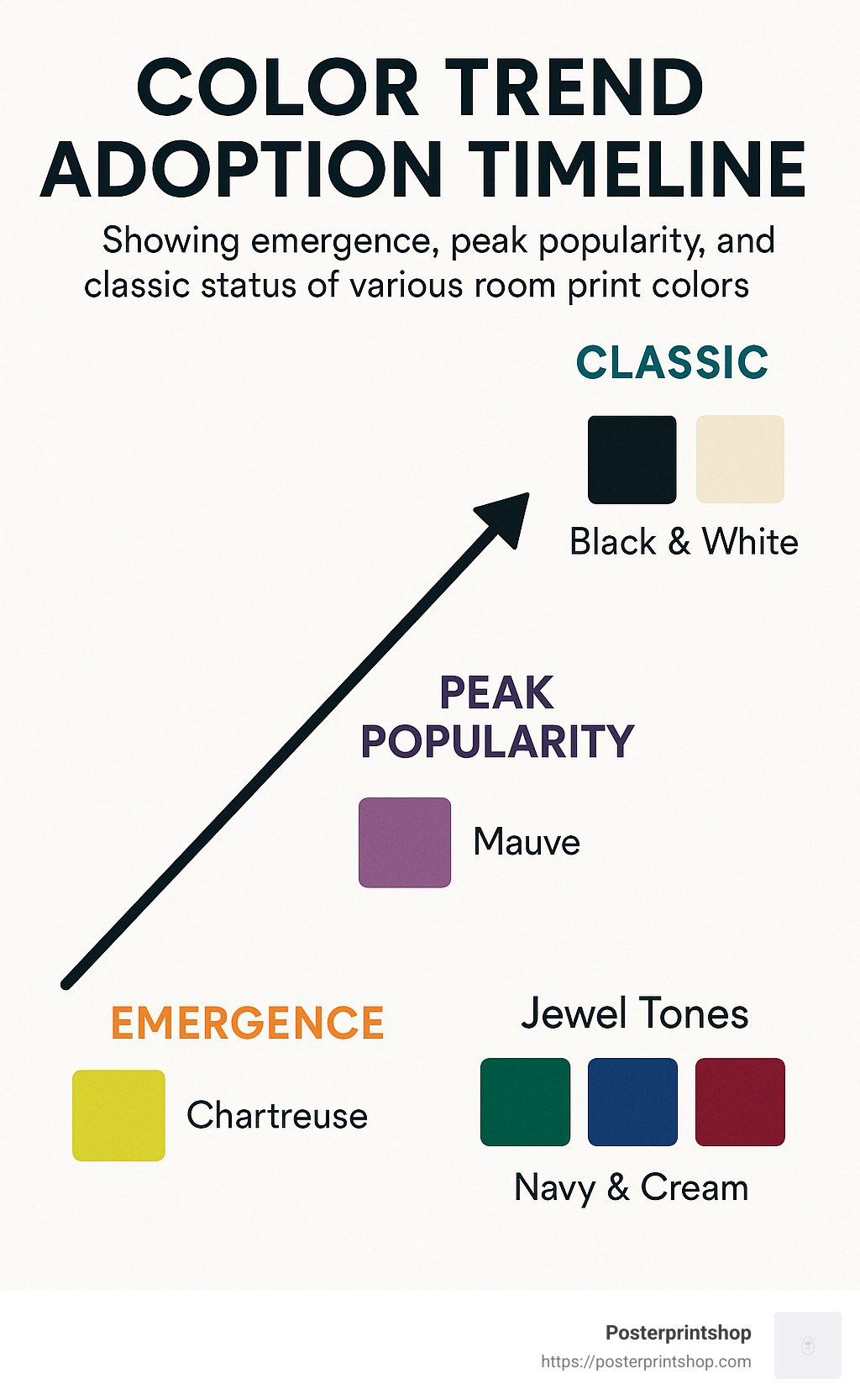
I love what one customer shared with me recently: “I was hesitant to invest in trendy colors for my wall art, so I chose prints with classic color schemes but contemporary subjects. Five years later, they still feel fresh and current.” That’s the beauty of thoughtful room print colour selection – finding that sweet spot between current trends and lasting appeal.
If you’re specifically looking for bedroom color inspiration, you might enjoy browsing through Let us share the best of them, which showcases beautiful bedroom color schemes that designers actually use in their own homes.
The best room print colour choices are ones that make you happy when you walk into the room. While trends provide fresh inspiration, your personal connection to colors should always guide your final decision.
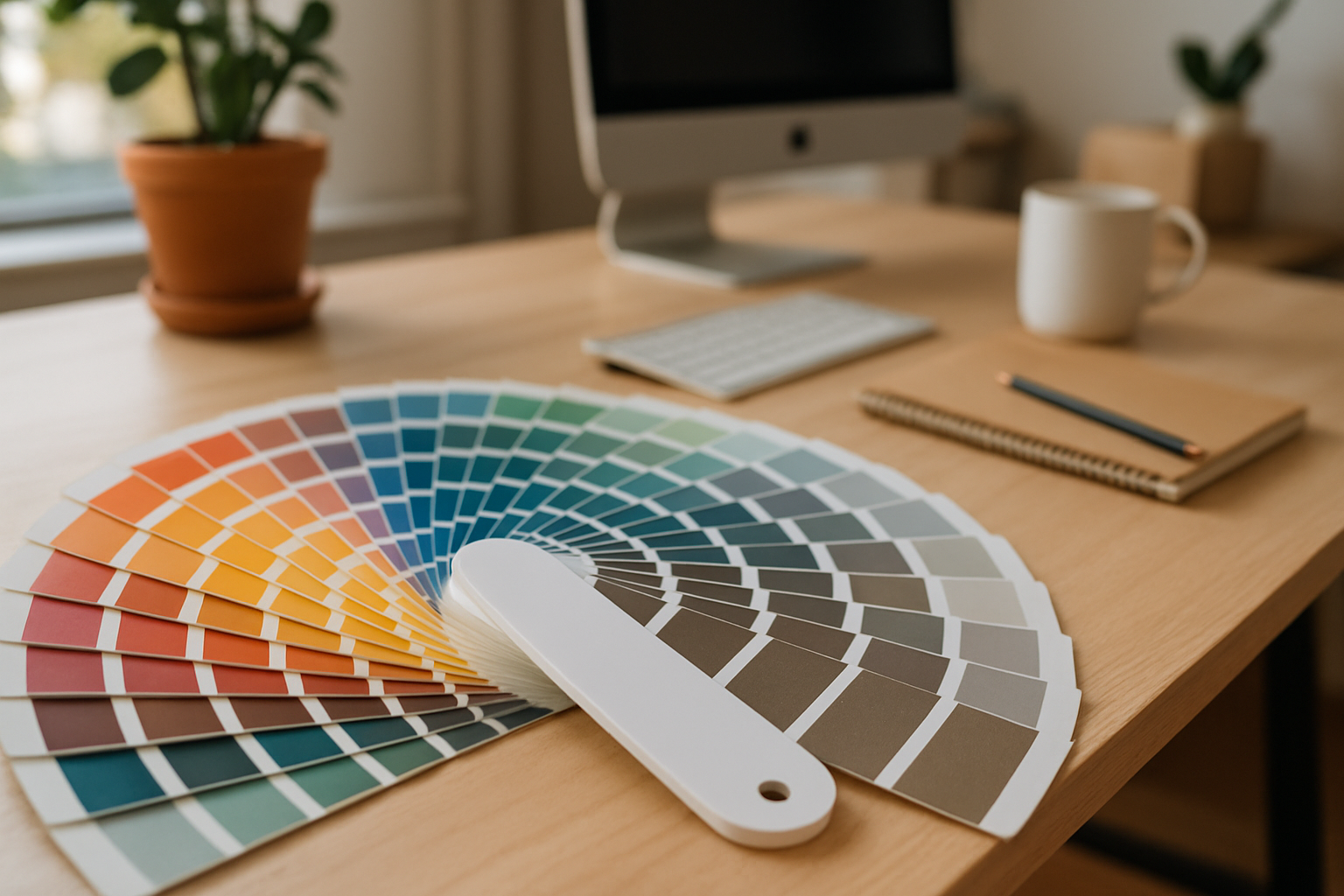
Let’s be honest—what looks perfect on your screen might feel completely different on your wall. That’s why testing your room print colour choices before making a full commitment is so smart. At Posterprintshop, we’ve seen the relief on customers’ faces when they take this simple precaution.
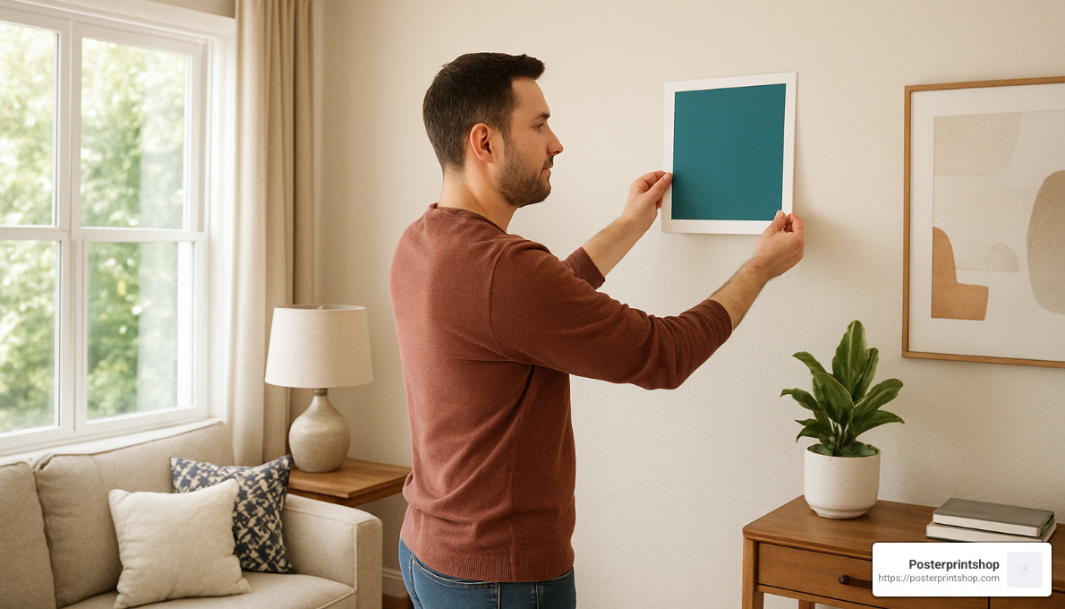
Starting with sample prints gives you the chance to live with colors in your actual space before investing in larger pieces. Place these samples on your wall and observe them throughout the day—morning light, afternoon shadows, and evening lamp light can completely transform how colors appear. I always tell my customers to hold their samples next to furniture, flooring, and other decor elements to ensure everything plays nicely together.
One customer recently shared: “I was absolutely convinced I wanted deep teal prints for my living room until I saw the sample in my space. The evening light made it look almost black! I ended up choosing a slightly lighter shade that maintains that rich teal look I wanted at all hours.”
Once you’ve found your perfect room print colour and installed your prints, proper care ensures they’ll stay vibrant for years. Keep them away from direct sunlight when possible—those UV rays are color’s worst enemy. For cleaning, a gentle approach works best: simply dust with a soft, dry cloth regularly. For protected prints, you can use a slightly damp cloth with mild soap for occasional smudges, but always test in a corner first.
Proper mounting is equally important for longevity. Securely mounted prints resist damage from curling, tearing, or warping. For more detailed advice on creating prints that stand the test of time, our guide on High Quality Poster Printing covers everything from paper selection to finishing options.
“Will this actually look good on my wall?” It’s the question everyone asks, and thankfully, there are several ways to answer it before clicking “order.”
Many of our customers have found success with augmented reality apps that let you virtually place artwork on your walls using your smartphone camera. It’s like magic—you can see how different sizes and colors work in your actual space without lifting a hammer.
Sample prints remain the gold standard for color confidence. There’s simply no substitute for seeing the actual printed colors in your space. At Posterprintshop, we offer pre-production 30×30 cm fabric swatches for custom projects specifically for this purpose.
For the digitally inclined, taking a photo of your room and using basic editing software to overlay images of potential prints can provide a surprisingly accurate preview. One customer told me she spent a happy evening “trying on” different prints in her living room photo before making her final selection.
Even simple paint swatches can help if you’re primarily concerned about color coordination. Hold them against your furniture and flooring to see how the colors interact.
Dark, north-facing rooms present a special challenge when selecting room print colour. Without adequate natural light, colors can appear dull or muted—but the right choices can transform these challenging spaces.
Warm yellows and golds work wonders in low-light situations. As one interior designer shared with us, “Print Room Yellow creates a feeling of instant warmth, especially in rooms with little natural light.” These sunny tones reflect what little light is available and create the illusion of sunshine even on gloomy days.
Consider the Light Reflectance Value (LRV) of your prints—higher values mean the color reflects more light back into the room. While deep navy might look stunning in a sun-drenched space, it can make an already dim room feel like a cave.
Glossy finishes are your friend in low-light rooms. They reflect available light, making colors appear more vibrant and helping brighten the space. Just be mindful of potential glare from lamps or overhead lighting.
One of my favorite customer changes involved a north-facing home office that felt perpetually gloomy. By adding prints with amber and honey tones in glossy finishes, the space was transformed. “I actually want to work in here now,” the customer told me. “It feels warm and inviting instead of cold and depressing.”
Keeping your room print colour looking fresh and vibrant requires a gentle touch. Think of your prints as the artwork they are—worthy of care and protection.
For regular maintenance, a soft microfiber cloth is your best friend. Gently dust the surface of unframed prints to prevent buildup that can dull colors over time. For prints protected behind glass or with lamination, you have a bit more flexibility—a slightly damp cloth with mild soap works for spot cleaning, but always test in an inconspicuous corner first.
What should you avoid? Anything abrasive. Paper towels, rough cloths, and harsh cleaners can scratch or damage print surfaces. And remember, a little care goes a long way—it’s better to clean gently and frequently than to scrub aggressively once in a while.
For large format prints, occasionally check the edges for any lifting and reseal if necessary. Environmental factors matter too—extreme humidity can cause paper prints to warp or develop mold, while excessively dry conditions can make them brittle.
If your prints will live in high-traffic areas or moisture-prone spaces like kitchens, consider our polypropylene or vinyl options. One customer who installed food photography prints in her kitchen chose our wipeable vinyl material: “Spaghetti sauce happens,” she laughed. “Now I just wipe and it’s good as new.”
With the right care, your perfectly chosen room print colour will continue to improve your space for years to come. And remember, we’re always here at Posterprintshop to help you select not just beautiful colors, but the right materials to ensure they stay beautiful in your unique environment.
Selecting the perfect room print colour is like cooking a great meal—it takes the right ingredients, a bit of science, and a dash of personal flair. Throughout this guide, we’ve explored how the colors you choose for your wall art can transform an ordinary room into something that feels uniquely yours.
Think about how you felt walking into a perfectly designed hotel room or a friend’s home that just felt “right.” That feeling didn’t happen by accident—it came from thoughtful color choices working in harmony with the space.
Your bedroom deserves calming blues and greens that help you unwind after a long day. Your dining area will come alive with those appetite-stimulating reds and yellows. And your living room? Those balanced greens and versatile neutrals create the perfect backdrop for family gatherings and quiet evenings alike.
The direction your windows face matters more than you might think. North-facing rooms need warmer print colors to counterbalance that cool light, while south-facing spaces can handle almost any hue thanks to that gorgeous golden sunshine streaming in.
I’ve seen countless customers transform their homes with the 60-30-10 rule—using their dominant room color for 60% of the space, a complementary color for 30%, and that perfect pop of accent color (often in their wall prints) for the final 10%. This simple formula creates spaces that feel professionally designed yet personally meaningful.
Don’t skip the testing phase! I still remember a customer who was absolutely certain she wanted bold red prints for her office until she saw the sample in her actual space. The warm afternoon light transformed it completely, and she ended up choosing a rich terracotta instead—a decision she’s thanked us for years later.
At Posterprintshop, nothing makes us happier than helping you find wall art that makes you smile every time you walk into the room. Our printing processes are designed to capture every subtle shade and gradient, ensuring your chosen colors remain vibrant for years to come.
Your home should be your sanctuary, your playground, your personal gallery—sometimes all in the same day. The right room print colour choices help create those different moods and moments, turning four walls into a space that truly feels like home.
Ready to bring your walls to life with color? We’d love to help you find prints that speak to your style and improve your space. For more details about our wall print options and services, just visit More info about wall print services.
Your walls are waiting. Let’s make them beautiful together.